Bison Investments
Branding | Identity
The owner of Bison Investments came to me with only his company name. He wanted to use a symbol that conveyed that they are an American made company that is trustworthy and stable. He said that when he thinks about long-standing symbols of American roots, he thinks of the American bison.
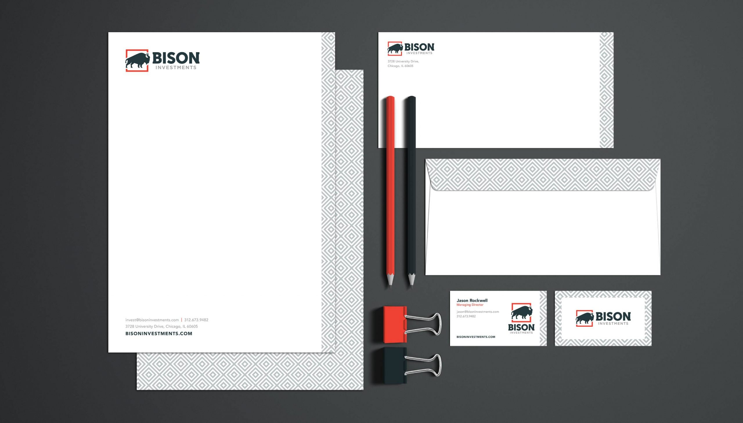
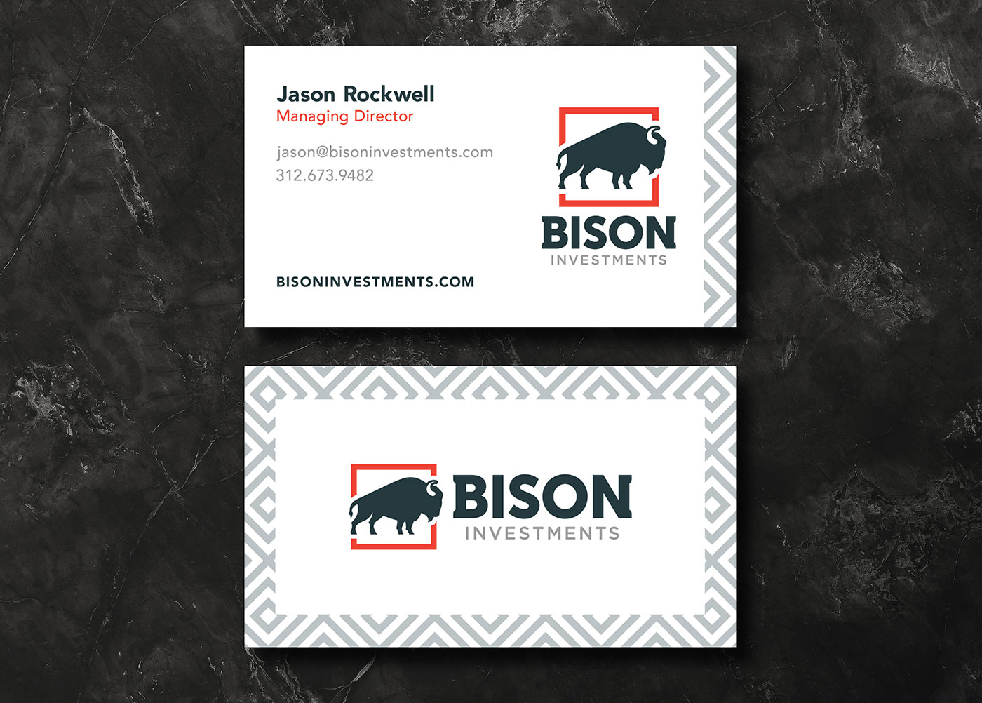
I took notes on his thoughts and intentions for the brand and spent some time sketching logo concepts that would incorporate his goal of instilling trust and stability. The symbol of the bison and the color scheme work together to give a trustworthy and contemporary feel for this American made investment company. I used red, white, and blue without making the colors too playful or saturated. I toned them down and pushed for a darker blue to achieve a more sophisticated feel. The “B” and the “N” share some light serifs on the outside edges as a subtle nod to the horns on the bison icon. The icon of the bison has a strong stance with an implied motion from left to right. This is a nod to the slow but steady growth of the financial investments of the customer that will grow over time.
